Custom Dashboards
Introduction
Custom Dashboards lets users build their own configurable dashboards inside Fenergo, combining the data into a single, interactive view. Each dashboard is made up of widgets, tables, KPI cards, and charts, that draw their data from Advanced Reporting queries, including those generated with KYRA:Report. Dashboards are built on the Advanced Reporting architecture, so the data the widgets display respects the same access-layer security as any other report.
With Custom Dashboards users can:
- Create dashboards from scratch or from a shared template and organise them as tabs.
- Add various widgets to a flexible grid and control their size and height.
- Bind widgets to your saved reporting queries, with dashboard-level parameters and filters.
- Format columns and values, apply threshold and status colours, and configure interactive drill-through links.
- Move from the macro to the micro by drilling from one dashboard into an entity, journey, task, or another dashboard.
- Assign tasks to team members directly from a dashboard table.
- Build views tailored to specific operational and management needs.
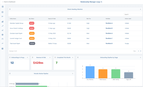
As well as Advanced Reporting permissions, users also require Command Centre Access permission.
Each widget displays a maximum of 1,000 records. Where a widget's data source returns more than 1,000 records, only the most recent 1,000 are displayed; older records beyond this are not shown. This applies to every widget individually, so the values, counts, and totals shown are based on the most recent 1,000 records only, not the full result set. To keep the most relevant records within this limit, refine the widget's query or use dashboard parameters and filters to narrow the result set..
Creating a Dashboard
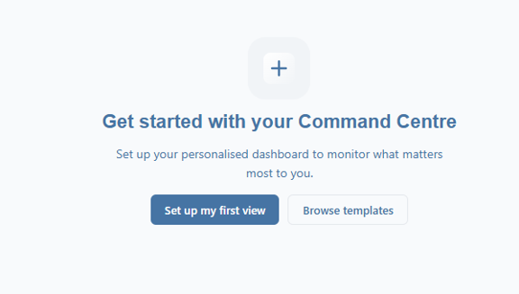
- Open the Command Centre: select set up my first view to create a new personlaised view or browse templates
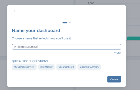
- Give the dashboard a name: Enter a name, max 60 characters or opt for one of the suggestions. The name must be unique among your dashboards
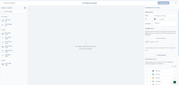
- Create new dashboard: On confirmation, the new dashboard opens directly in the builder (edit mode), ready for widgets to be added
- Add more dashboards: From the dashboard tab bar, add a new dashboard using the + control. To rearrnge dashboards on the dashboard bar, neviagte to the bar menu and select edit bar. Users can also create a personal dashboard by copying an existing shared (public) dashboard as a starting point, then customising it to suit needs. Shared dashboards can be found by selecting the ‘Browse all dashboards’ option below.

- Rearrange dashboards: To rearrnge dashboards on the dashboard bar, neviagte to the bar menu and select edit bar

Adding and Arranging Widgets
Open the widget library panel on the left to browse and add widgets to the dashboard canvas. Custom Dashboards give users extensive control over how data looks, so users can turn a plain result set into a clear, engaging view.
Widget Types
The following widget types are available:
- Data Table: displays report results as an interactive table.
- KPI Card: highlights a single key metric or value.
- Gauge Chart: shows a value against a target, with red/amber/green status.
- Sparkline Chart: a compact trend line for a single metric.
- Bar Chart: compares values across categories; supports stacked or grouped layouts.
- Line Chart: shows trends across an ordered or time-based series.
- Area Chart: a filled line chart that supports stacking.
- Donut Chart: shows proportional segments of a whole.
Arranging and Sizing Widgets
Drag a widget to position it. Overlapping widgets are automatically arranged. Each widget’s size and height are set from the left hand sise configuration panel:
Width controls the width in grid columns: Small: 3 columns Medium: 6 columns Large: 9 columns Xl: 12 columns, full width
Height controls the vertical space: Auto: fit the content Compact:1 row Standard: 2 rows Tall: 3 rows Full: 4 rows
Colour Scheme
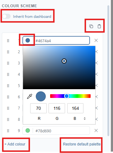
- Widgets can inherit dashboard-level colours for consistent branding. This keeps charts, badges, and status indicators visually consistent across the whole dashboard.
- To define a new palette, users can change the colours by selecting the colour. This opens a dropdown where the colour can be selected by hex code, RGB or HSL, selected on the grid or matched to another colour in the dashboard.
- The colours can be changed back to the default by selecting ‘Restore default palette’.
- Colour palettes can be copied and pasted in from different widgets through the copy and paste icons
Connecting Widgets to Your Reports
Each widget is powered by a Data Source which is a saved query from Advanced Reporting
Choose a data source:
- In the widget configuration, open the data source picker and select a saved query. The picker lists each saved query once. Selecting a query loads its latest results for the widget to display. Users can pick from any saved query in the tenant not just ones they own.
- Each widget has a Refresh control that fetches the latest completed report for its data source, so users can update a widget with new data without rebuilding it.
Map the fields:
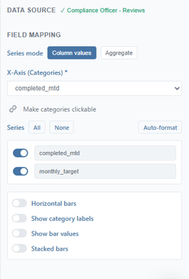
- Use the Field Mapping section to map the query’s columns into the widget’s data slots.
Formatting and Styling
The format and display options allow users to personalise how each widget presents data, turning a plain result set into a clear, engaging view. The controls available depend on the widget type, each expose the options relevant to them in the widget settings.
Table columns and fields
For a Data Table, users control both the columns and how each field is displayed. Columns’ header title can be changed, text made bold, and columns hidden, shown, or rearranged by dragging. An Auto-format option converts raw column names (such as camelCase or snake_case) into readable Title Case. Users can also set how many rows are shown per page and turn a field into a link so users can click straight through to what it represents, for example, the related entity or user.
Field types, values, and numbers
Each field can be formatted according to its type. Text fields display as-is; number fields can be shown as a plain number, currency, or percentage; and date fields can show the date, the time, or both. KPI, gauge, and sparkline widgets share number-formatting options including prefix e.g. currency symbol and suffix e.g. million. Number and date fields also support colour-coded thresholds, and comparisons can be made via breakdown aggregation.
Threshold rules and conditional formatting
You can define threshold rules on numeric and date columns to apply colour-coded formatting when a condition is met. Rules support comparison operators that can be associated colour for the various statuses e.g. danger, neutral etc. Rules are evaluated in order and the first match wins, and you can set a default colour for values that match no rule. On a gauge, thresholds drive the red/amber/green status; on a KPI card they tint the value; on a sparkline they can tint the line.
Colours and status
At dashboard level you can define a named colour palette and a semantic status colour scheme (neutral, info, success, warning, danger). Widgets can inherit these dashboard-level colours for consistent branding, or define their own — keeping charts, badges, and status indicators visually consistent across the whole dashboard.
Chart display options
For chart widgets, users can choose which value each axis represents and where the legend is placed. Multiple individual data points can also be aggregated into a single summary value
Dashboard Parameters and Filters
Parameters allow for users to build interactive dashboards where a single change updates many widgets at once, for example, a date range or a team selector that filters every widget on the page.
Adding Parameters
In dashboard settings (in edit dashboard), select the Add Parameter to set the parameters for your dashboard. For each parameter you set:
- Label: the human-readable name shown to users, a machine name is generated automatically from the label
- Type: such as text, number, date range, select (with options), or boolean
- URL key: the short name for the parameter used in the dashboard's web address, so a filtered view can be shared or bookmarked; created automatically from the label
- An optional default value
If a query returns no rows for the current parameter values, the widget shows a clear empty state and a message explaining that it will populate once the query produces data.

Actions from the Dashboard
Drill-through and Interactive Links
Interactive links turn a dashboard from a static view into a navigable one, letting users move from a high-level summary down to a specific record or another dashboard.
Creating a Link
Within Widget Settings in the Data Table Field Mapping, users can make a value a link by selecting the link icon and inputting a Type and an Id:
- Type: the kind of record the link points to: Entity, Journey, Task, or another Dashboard.
- Id: which column supplies the identifier used for navigation. This lets you display a friendly value (such as a journey name) while navigating using a hidden id column, so raw identifiers are never exposed to users.
At view time, linked values become clickable and take the user straight to the relevant entity, journey, or task.
Navigating from One Dashboard to Another
Using the Dashboard link type, users can drill from one dashboard into another. As well as selecting Dashboard as Type and filling in the Id, users select a Dashboard and a Parameter. For example, clicking a team in a summary table can open a team dashboard filtered to that team; clicking an individual can then open a dashboard filtered to that person’s tasks. This lets users build guided journeys from the macro view to the micro detail.
Assigning Tasks from a Dashboard
A Data Table widget can be configured to support task assignment, so users can manage workload without leaving the dashboard. To enable task assignment on a table, toggle on Enable task assignment in widget setting.
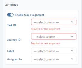
Tables refresh automatically after a successful assignment. Reassignment respects permissions, the action is hidden or disabled where users do not have the required scope.
Saving, Sharing and Managing Dashboards
Save your work with Save Dashboard, which saves the dashboard’s name, visibility, and all widgets together. Dashboards are Private by default. You can make a dashboard Public to share it with others in your tenant, optionally adding a description, public dashboards appear in the Shared tab of the gallery. Dashboards appear as tabs, which you can rename, reorder by dragging, and colour to help you organise them.
If a dashboard has any incomplete or invalid configuration, the Save Dashboard button shows and error state. Hover over it to see a summary of all outstanding issues, grouped by widget and field, so you can resolve them before publishing.
The Dashboard Gallery
The Dashboard Gallery is your central library for finding and opening dashboards. Open it from Browse all dashboards in the dashboard tab bar menu. The gallery organises all dashboards under three tabs:
- My: dashboards you own.
- Shared: public dashboards created by others in your tenant.
- All: every dashboard available to you.
Use the search box to filter dashboards. Each dashboard is shown as a card displaying its name, creator, widget count, and last-modified date, along with a preview of its layout.

Dashboards you no longer want on your dashboards bar can be closed using the X icon in the dashboard tab, rather than deleted. Closed dashboards are removed from the active tab strip but retained in the gallery, where you can Reopen or Delete them at any time. Deleting a dashboard, by contrast, removes it permanently.
Best Practices for Custom Dashboards
- Design or generate your queries first with Advanced Reporting or KYRA:Report then build widgets on top of them.
- Use dashboard parameters and the filter drawer to build one reusable dashboard rather than many near-identical ones.
- Apply threshold rules and status colours consistently, using the dashboard palette, so users can read status at a glance.
- Use drill-through links to guide users from summary dashboards down to entities, journeys, tasks, and detail dashboards.
- Keep dashboards focused, a smaller number of well-chosen widgets is easier to read than a crowded page.
- Refine the data source using parameters and filters to narrow the result set before creating a widget.