The Business Metrics Area
Introduction
The Business Metrics area is designed to help you gain deeper insights into your Fenergo activities. This guide will help you navigate the new dashboard and make the most of its features.
Accessing the Dashboard
To access the Business Metrics Dashboard, visit https://app.fenergox.com/business-metrics/. Please note that you need the Business Metrics Access permission to view this page. If you do not have this permission, contact your system administrator to request access.
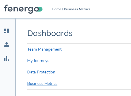
It can also be accessed in the 'Dashboards' area of the sidebar.
Journey Metrics
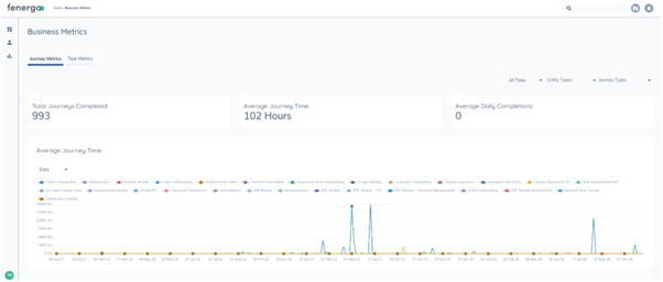
The Business Metrics Dashboard for Journeys provides a comprehensive view of journey completion metrics, allowing you to understand the trends behind your journey processes since the day a tenant was created.
Key Questions Answered by the Journey Metrics Dashboard
The Business Metrics Dashboard for Journeys is designed to help you answer important questions about your Fenergo usage.
- What journeys have we done? Use the dashboard to view a full history of completed journeys, organized by type and entity.
- What were our busiest times of the year/month? Analyze the trends over time to identify peak periods in your journey completions.
- Where are we spending most of our effort? Examine the aggregate hours spent to determine which journey types are requiring the most effort.
- How have our onboarding times changed since we started using Fenergo? Track average journey times over different periods to see improvements or changes in efficiency.
- What journey types take the longest? Identify journey types with the highest average completion times to pinpoint potential bottlenecks.
Categories that Business Metrics Dashboard for Journeys
Number of Journeys Completed:

How many journeys have completed in the selected time range.
Average Journey Time:

Of the journeys in the selected time range, how many hours did they take on average. Time is calculated as the moment the journey started to the moment it completed, it does not take into account journey pausing.
Average Daily Completions:

This number provides the rate of completion. It gives an understanding of roughly how many journeys are being completed per day for the selected time range.
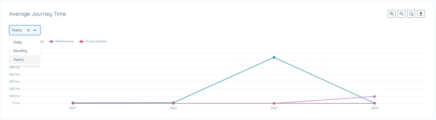
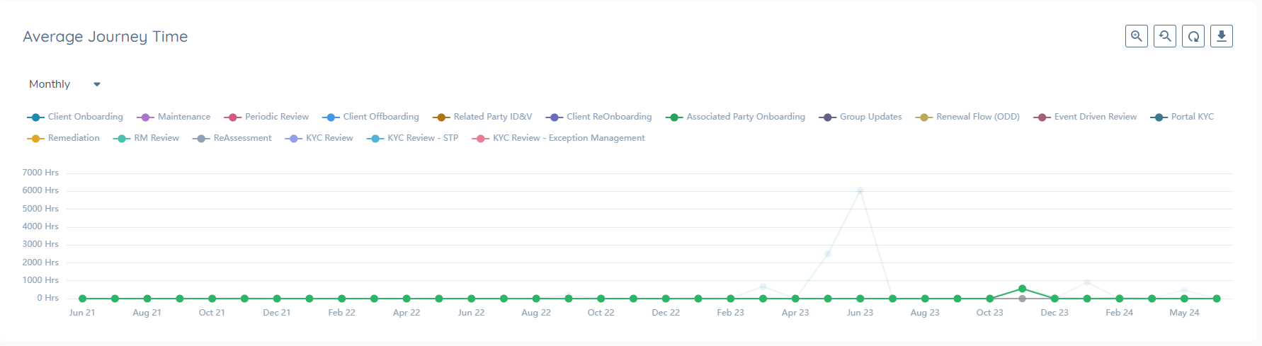
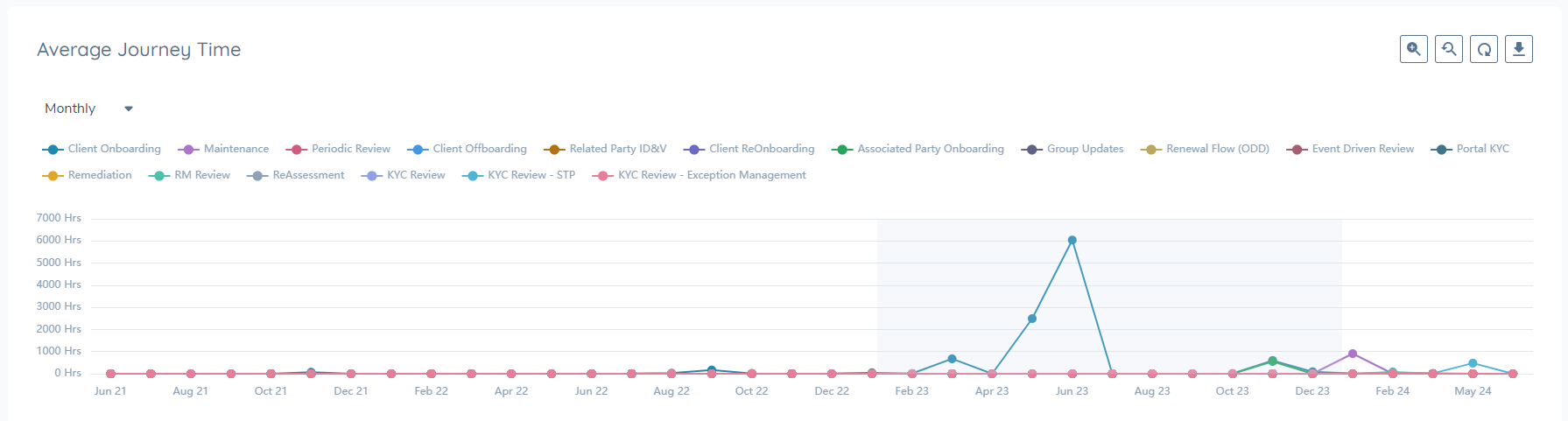
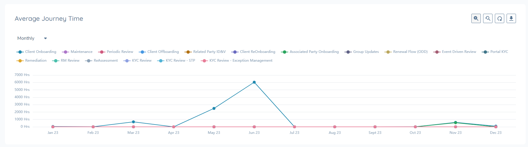
Average Journey Time Graph:
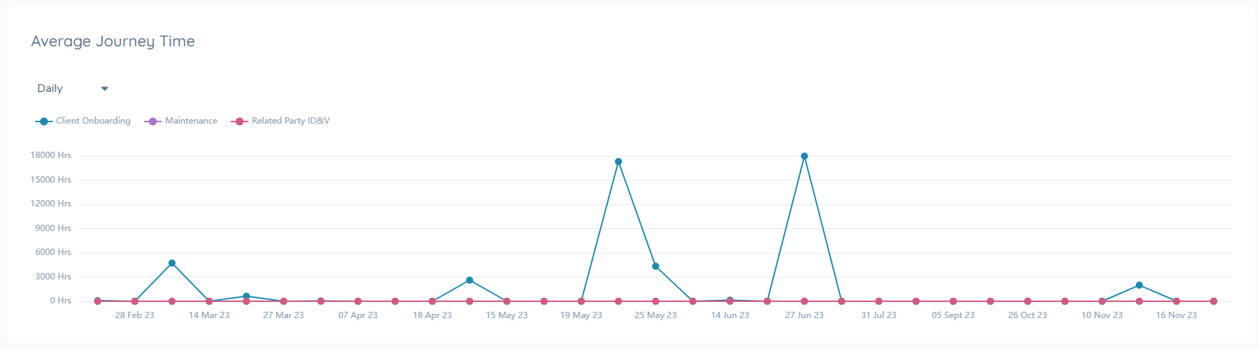
This visual shows how your average journey time in hours has changed over days, months, and years. Each journey type is represented by a line. Average time is calculated as: of all the journeys completed that day, how long did they take on average? This visual can be used to understand if your journey time if improving over time, or to identify exact dates journey times were impacted.
Number of Journeys Completed Graph:
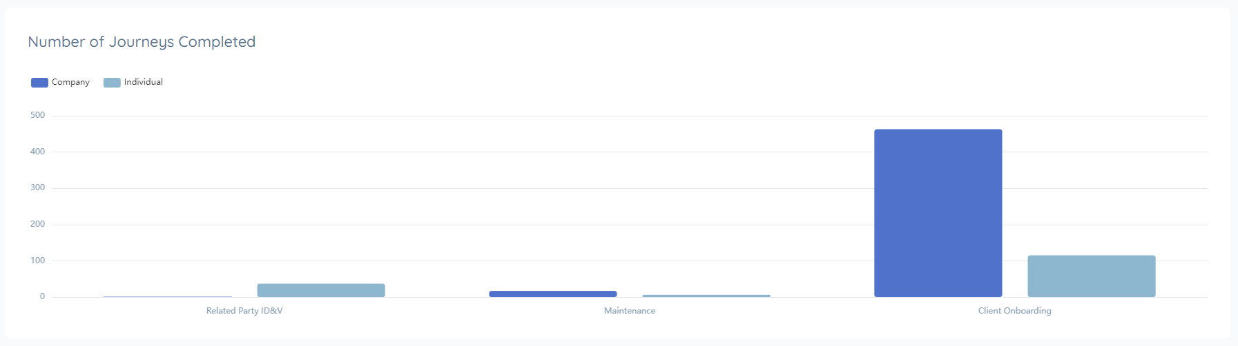
This visual shows how many journeys you've completed of each type. It provides context if the journeys were for an individual, company, entity group, or 'other' type. This graph can be used to understand where the most focus is being spent for the selected time range.
Journeys Completed by Type Graph:
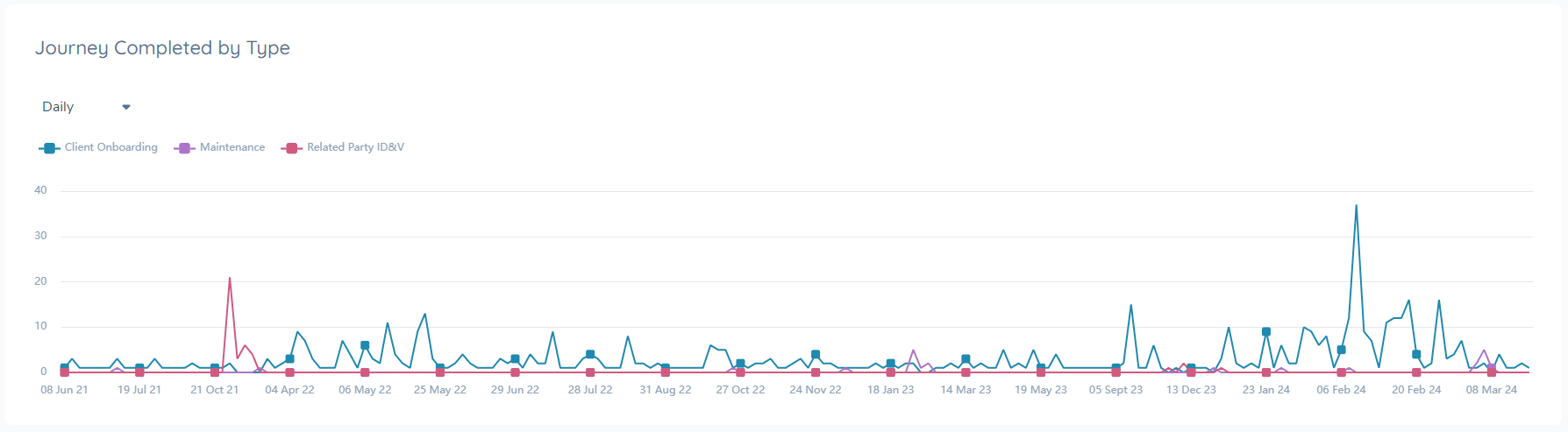
This visual shows which journey types are completed over days, months, and years. Each journey type is represented by a line. This graph can be used to understand how focus has changed over time, and if certain journey types peak/trough at significant periods.
Aggregate Hours Spent per Journey Type Graph:
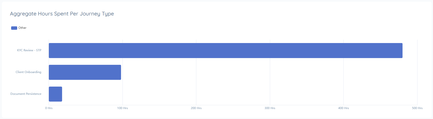
This visual shows how many cumulative hours journeys were open, organised by journey type and entity type. This graph can be used to show where effort is being spent. Every moment a journey is open is counted, so this graph can help illustrate how many hours in total work is 'active' and in the process of being completed.
Task Metrics
The Tasks Metrics Dashboard offers a complete view of task completion data, enabling users to analyse patterns and gain actionable insights.
Key Questions Answered by the Dashboard
The Task Level Business Metrics Dashboard is designed to provide clarity on your task-level operations.
- What tasks are completed most frequently? View a comprehensive history of task completions, organized by type and associated entity.
- What times of the year/month see the most task activity? Analyze trends to identify peak task periods.
- Where is effort being most concentrated? Review cumulative hours spent on tasks to determine which types demand the most resources.
- How have task completion times changed over time? Track average task durations to monitor improvements or emerging challenges.
- Which task types take the longest to complete? Identify the task types with the highest average completion times to find areas for potential optimization.
Categories that Business Metrics Dashboard for Tasks
Total Number of Tasks completed:

How many of selected Tasks have been completed within the defined set range.
Average Task Time:

Of the tasks selected in the chosen date range, how many hours did they take on average. Time is calculated as the moment the task started to the moment it completed, it does not take into account task pausing.
Total Reopened Tasks:

This metric tracks the total number of Reopened Tasks based on the selection of the user in the Tasks tab.
Total Automated Tasks:

This metric tracks the total number of automatically closed tasks (using Automation rules) based on the selection of the user in the Tasks tab.
Using Filters
For Journeys:
To customize the data displayed on the Journey Busienss Metrics dashboard, you can use the filters provided at the top of the page. For Journeys, the filters allow users to narrow down the data by journey type, entity type, and date range. For example, if you want to view only Client Onboarding Journeys over the past month, simply adjust the filters accordingly.
Example Filter Usage:
- Date Range: Set the date range to the past month.
- Entity Type: Choose the specific entity type you are interested in.
- Journey Type: Select "Client Onboarding" to focus on onboarding journeys.
![]()
For Tasks:
Filtering on tasks works in a similar way with one key difference where users will first apply a filter by Task Type, before then filtering by Task Name and Date Range.
When the user first lands on the Task Metrics section, the page will be blank. This is because the user must first select which Task Types are in scope for the Data that they want to retrieve. When the user selects at least one Task Type, data will start to be presented on the page.
By applying these filters, the dashboard will update to reflect only the relevant data, providing a more tailored view of your metrics.
For the Tasks Tab, filters allow you to narrow down the data by task type, task name and date range.
Graph Controls
Each graph on the dashboard is equipped with tools that allow you to explore and understand it's data.
Daily, Monthly, Yearly Views:
Where applicable, the graph can be aggregated by daily, monthly, or yearly views. Select the dropdown to change the graph view.
Tooltips:
Hover over the graph to get a granualar view of the exact datapoint being displayed.

Category Filters:
Click on any of the labels to show/hide it from the view. Use the reset button to reinstate the original filter selections.
Zoom:
Activate zoom by clicking on the zoom icon. Then highlight any area of the graph, and it will zoom in to give a more detailed view of the selection.
Download Graph:
Click the download icon to save a PNG file of the graph, that can be used in external reports or materials to illustrate metrics trends.

The Business Metrics Dashboard is protected by the ‘Business Metrics Access’ permission. It's important to note that the numbers represented in the dashboard do not account for individual user access layers. For example, a user with “Singapore Only” access may only be able to access 100 journeys in the tenant, but they may see “200 journeys completed” on this dashboard. They cannot see the journey details, just the overall counts. If users should not know total counts, this permission should be carefully managed in order to control access.